


Designing and building a product database to help my mom understand and navigate our family healthcare business
My dad started and ran a medical supplies business for over a decade. After his sudden passing in September 2024, the responsibility of running the business fell upon me and my mom. To help with this transition, I designed and built ![]() , a product database that helps my mom and new incoming managers quickly access critical product, pricing and supplier information, giving them a clearer, more structured view of the business.
, a product database that helps my mom and new incoming managers quickly access critical product, pricing and supplier information, giving them a clearer, more structured view of the business.
Context
The business didn't have a single source of truth
Product information was fragmented across my dad's notebooks, scattered Excel files, a legacy accounting system only he knew how to use, and ongoing conversations with hospital purchasing teams.
After running the business for several months and making and paying for hundreds of invoices, I was able to answer important questions such as:
Goals
Designing for simplicity and speed
My mom was eventually going to take over the business, so the primary goal was to simplify and make the database super easy to use. Beyond usability, I believed that organizing and connecting product data in one place would lead to faster decision-making.
With that in mind, I scoped v1.0 around a few considerations:
Process
Get one piece done to build a working prototype
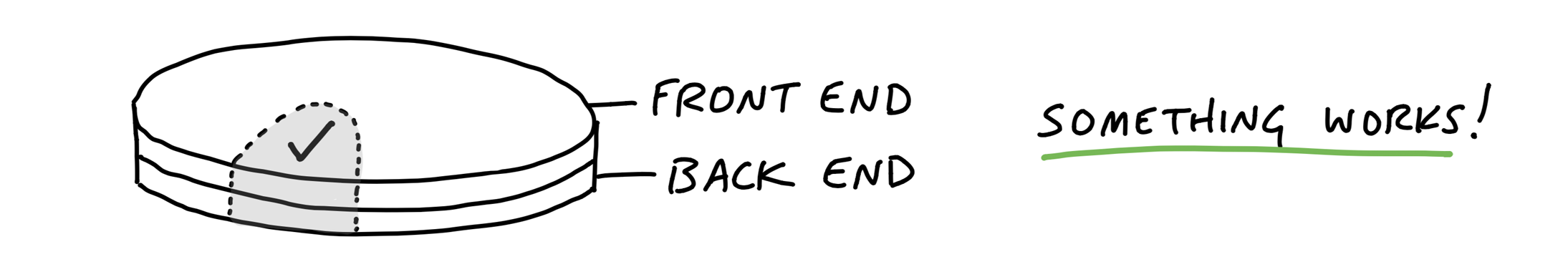
Basecamp’s Shape Up philosophy helped me find early footing. I applied the “get one piece done” idea to build a thin, end-to-end slice of the core experience (front end + back end) using dummy data and built the first working prototype in Cursor.
From Basecamp's Get One Piece Done
Database design
Reliable, scalable information was the foundation of the experience, so a future-proof relational schema was critical. I implemented the database in Supabase and modeled “one product, many rates” to ensure scalability of the data.
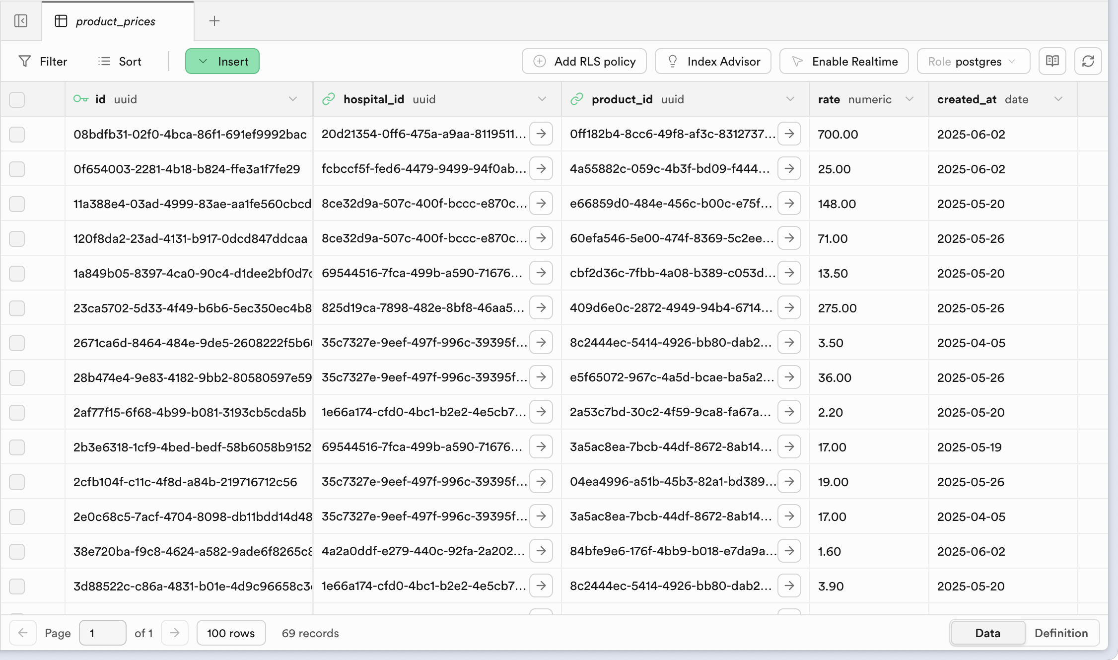
Database built using Supabase
Brand
I shaped the brand and overall feel of Lookup. I wanted it to feel approachable and friendly. This informed decisions around spacing, typography, layout density, and even the overall scope. The choice of colors and the resulting palette were an extension of the colors my dad had chosen.


Glo
Solution
One source of truth, multiple use cases
Lookup can also be used while creating sales invoices. A manager can choose the hospital and immediately validate the expected rate for each product, reducing back-and-forth and pricing errors. Lookup also supports generating a printable rate sheet (permission-gated) that can be saved for reference for non-technical managers or taken for rate negotiations.
Step 1 of 2
Select a hospital, find the products and the rate. The Hospital Page is Lookup’s most-used workspace, designed for fast, day-to-day pricing checks at a glance.

Step 2 of 2
Dive deeper into each product for more insights. The Product Page features a denser view built on a familiar e-commerce IA.
Details
Information design
Each product shared a fixed set of specifications (size, type, ply, plain vs. X-ray). Rather than expanding the table with additional columns, I simplified the layout and relied on visual parsing to make product differences easier to scan.
- Aligned product naming with the accounting system to ensure consistency across tools
- De-emphasized repetitive labels to surface the specifications that actually differentiate products
- Used color to distinguish Plain vs. X-ray, making it easy to quickly discern different products
Lists vs. tables on smaller breakpoints
I prototyped multiple concepts to get the right feel of speed, information density and minimal interactions.

A full-width table on mobile felt slow and fatiguing: with four columns (and potentially more later) plus long product names, it forced horizontal scrolling and would’ve required complex “frozen column” behavior. Even with higher information density, it made it harder—and slower—to find the right product.

A collapsible list seemed promising at first, but it created interaction issues—unclear tap targets for opening the detail page (or the need for an extra button). More importantly, while it was fast to scan names, hiding key details behind another tap made the overall flow feel slower.

Recall on scroll
Many products have similar names due to overlapping specs. On the detail page, I surfaced the key differentiator (R2S vs Non-R2S) in the breadcrumb so it stays visible as you scroll.
Hover for more information on devices with pointers
Because the same product can be sold to multiple hospitals, I added lightweight cross-context cues: on row hover, the table reveals how many additional hospital rates exist for that product. For deeper information at a glance to help understand if we sell the product to other hospitals.
Impact
Change in workflow
One of the main use cases I have observed: Flow to verify rates.
Prepare invoice
Prepare invoice
On average, each invoice has 3 products
Tech Stack
Building on the web is fun
Modern web frameworks and tooling made this project possible to build quickly and confidently. Using Next.js, Tailwind, and the JavaScript ecosystem allowed me to focus on product design and usability rather than infrastructure, while strong documentation and community support helped accelerate development.
What's Next
Roadmap for v2.0
v2
Improving loading speeds
The Hospital and Product pages take a while to fetch the data and render the page. This is priority number one. Want to add loading states/skeleton screens to improve perceived performance.
Accordian transitions on the Product page
Improved closing and opening of accordians leads to scroll jumps
Improve table design on Product page
Make it easier to compare rates across hospitals. Currently, a user takes more time parsing the rates across the entire width of the Rates component.